COVID-19 Statistics Web Application - Additional Graphs
After publishing my original application, I decided to add a few graphs to it to show daily test results and a few other trends. This is a short post to describe the changes.

Charting in Angular
There are several good charting libraries in Angular to use. For this, I decided to use ngx-charts. Mainly since my app was using SVG to render the USA map, I wanted a charting library based on SVG too.
A lot of charting libraries will render based on the HTML Canvas element. While this is a good approach, sticking within the same HTML elements reduces the number of cross-browser issues. SVG also is better with issues like resizing as the browser handles it natively. It's possible to get around these with Canvas, but it can be a pain at times.
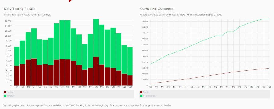
The chart on the left is a stacked vertical bar chart. While the chart on the right is an ordinary line chart. These were both native charts in ngx-charts. They mostly worked out of the box. I had a few issues with the library. Some parameters provided very non-descriptive errors if they weren't provided or weren't used correctly. To get started with the charts it was a lot easier to copy some of the examples they had as a baseline and reconfigure as needed for the two charts. That mostly got by the problem.
It took a little time last night and tonight to get the charts in the page, so the library worked as expected. The COVID Tracking Project also had all the APIs keeping historical records of the data. A few extra API calls to their service and mapping the data into the format expected by the ngx-chart components did the trick.
It's so simple to make modern data-centric web applications in Angular. I love Angular!